Sam Buswell
Hey, I am SAm!
I enjoy turning ideas into real, usable experiences, whether through thoughtful design or creative problem-solving.
I have a particular interest in packaging design, motion, and brand identity, where I can combine creativity with purpose to bring ideas to life.
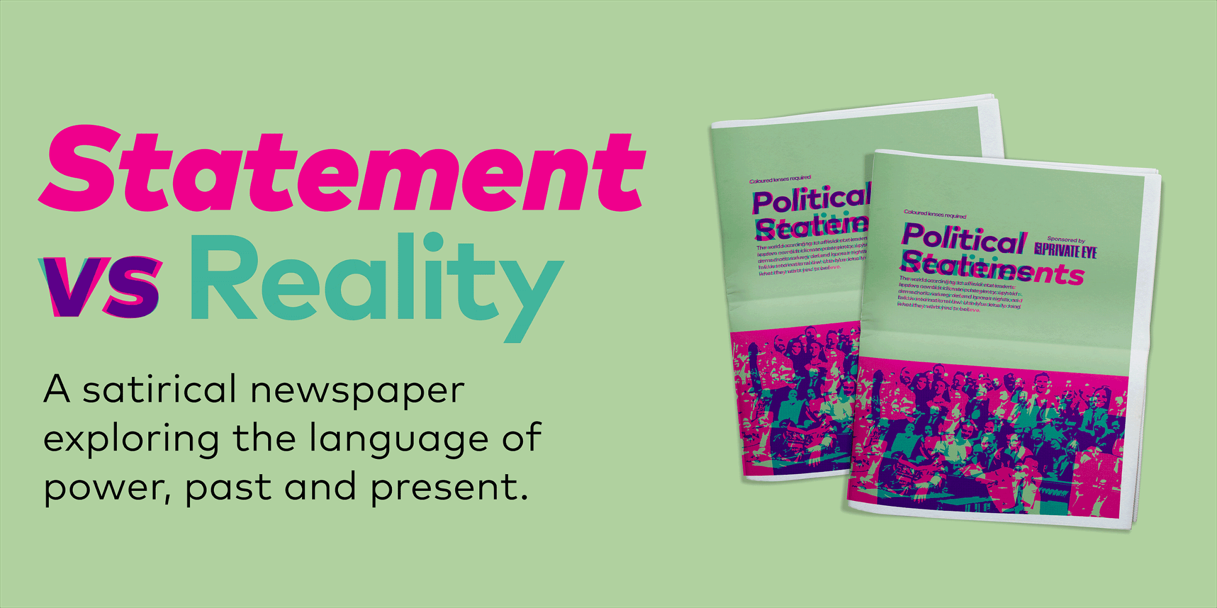
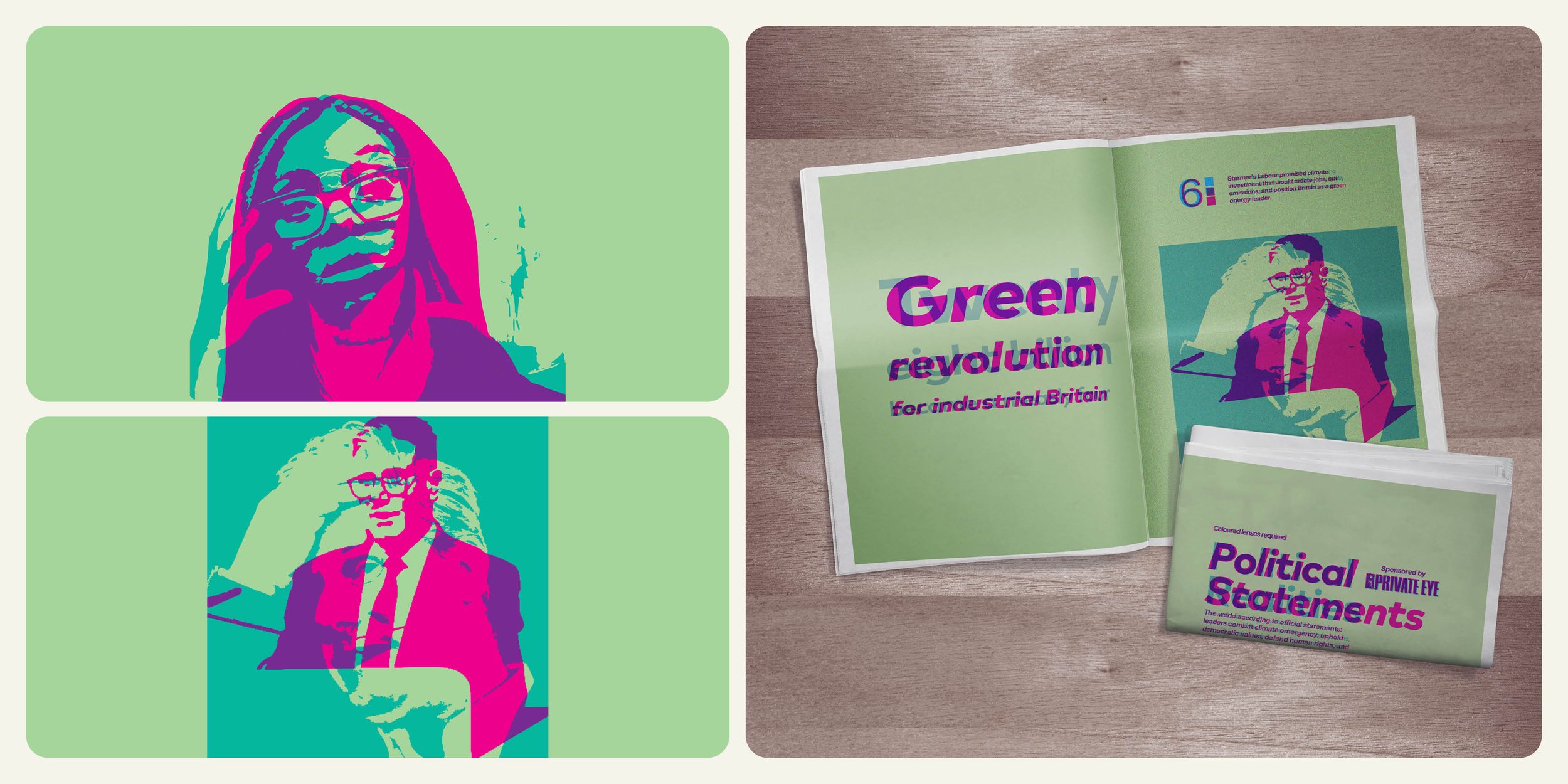
Statement vs Reality
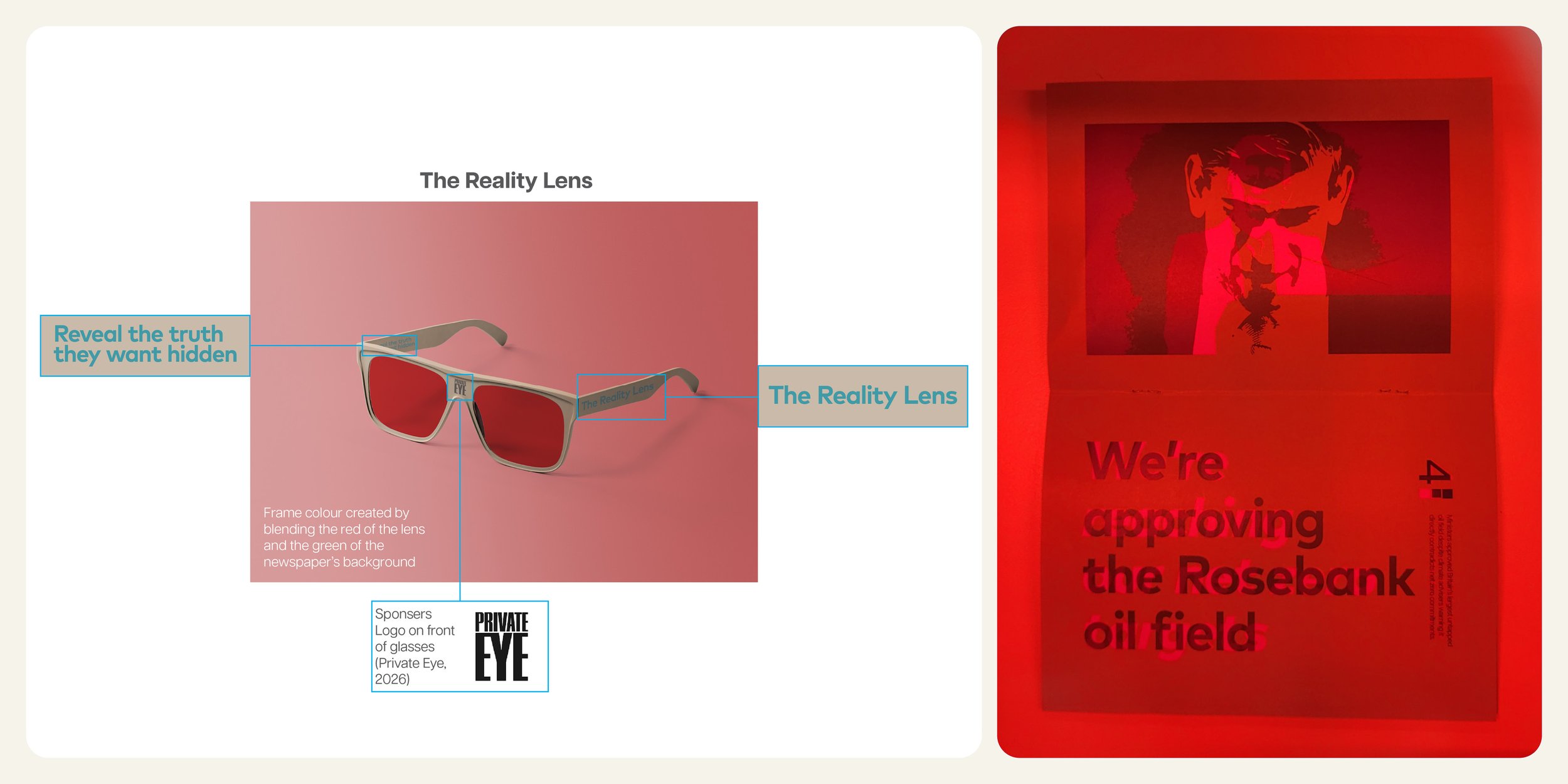
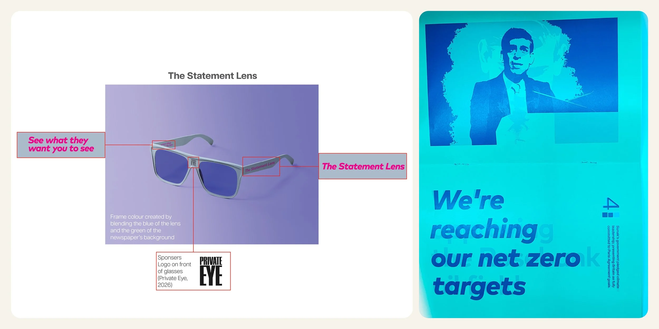
Statement vs Reality is an ISTD competition entry exploring the gap between political language and lived experience. Using a custom dual-lens typographic system, the work is printed so that two separate messages occupy the same space.
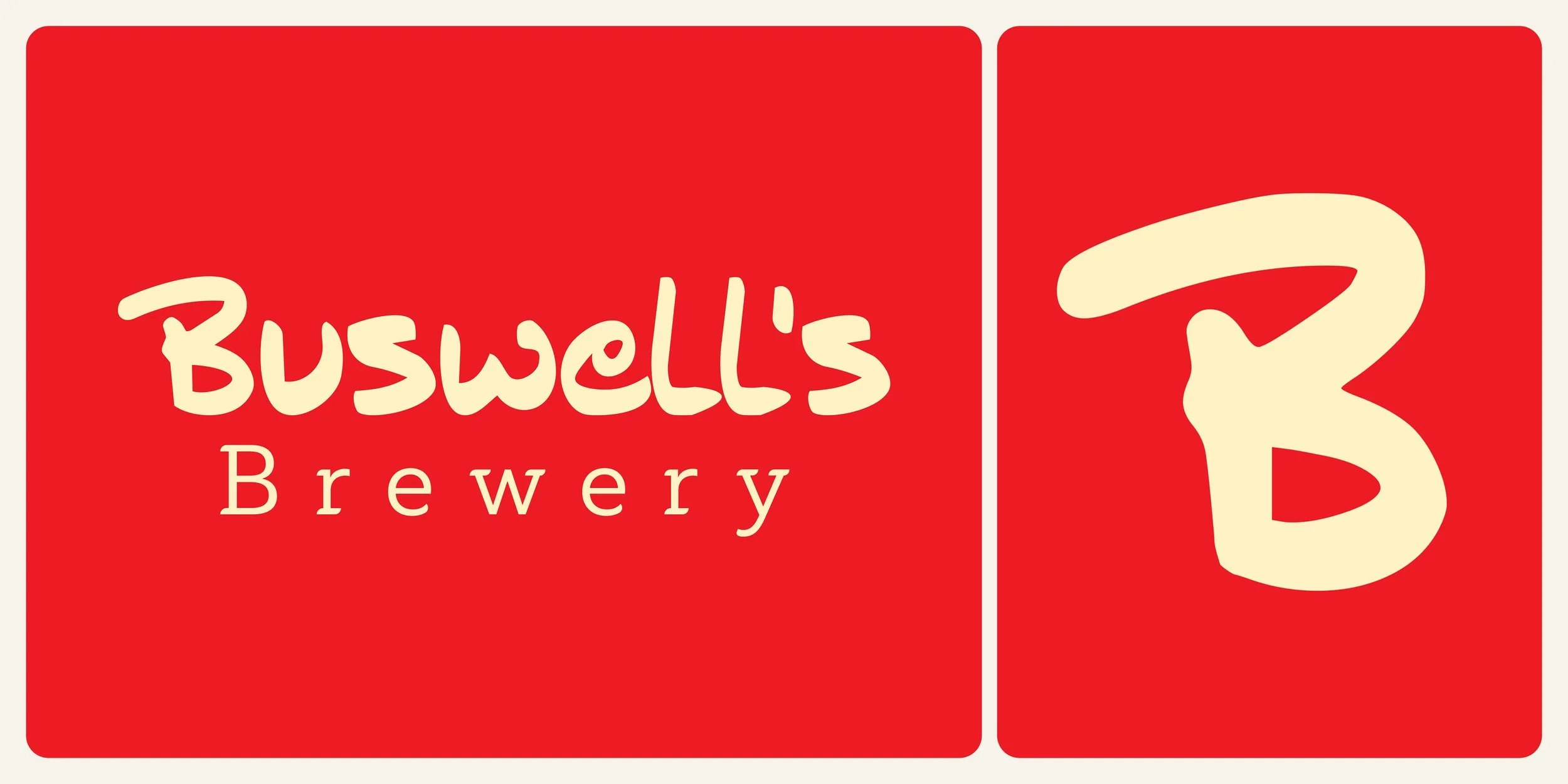
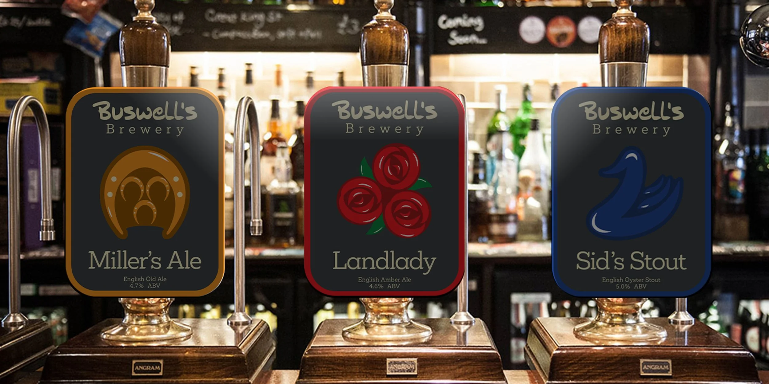
Buswell's Brewery
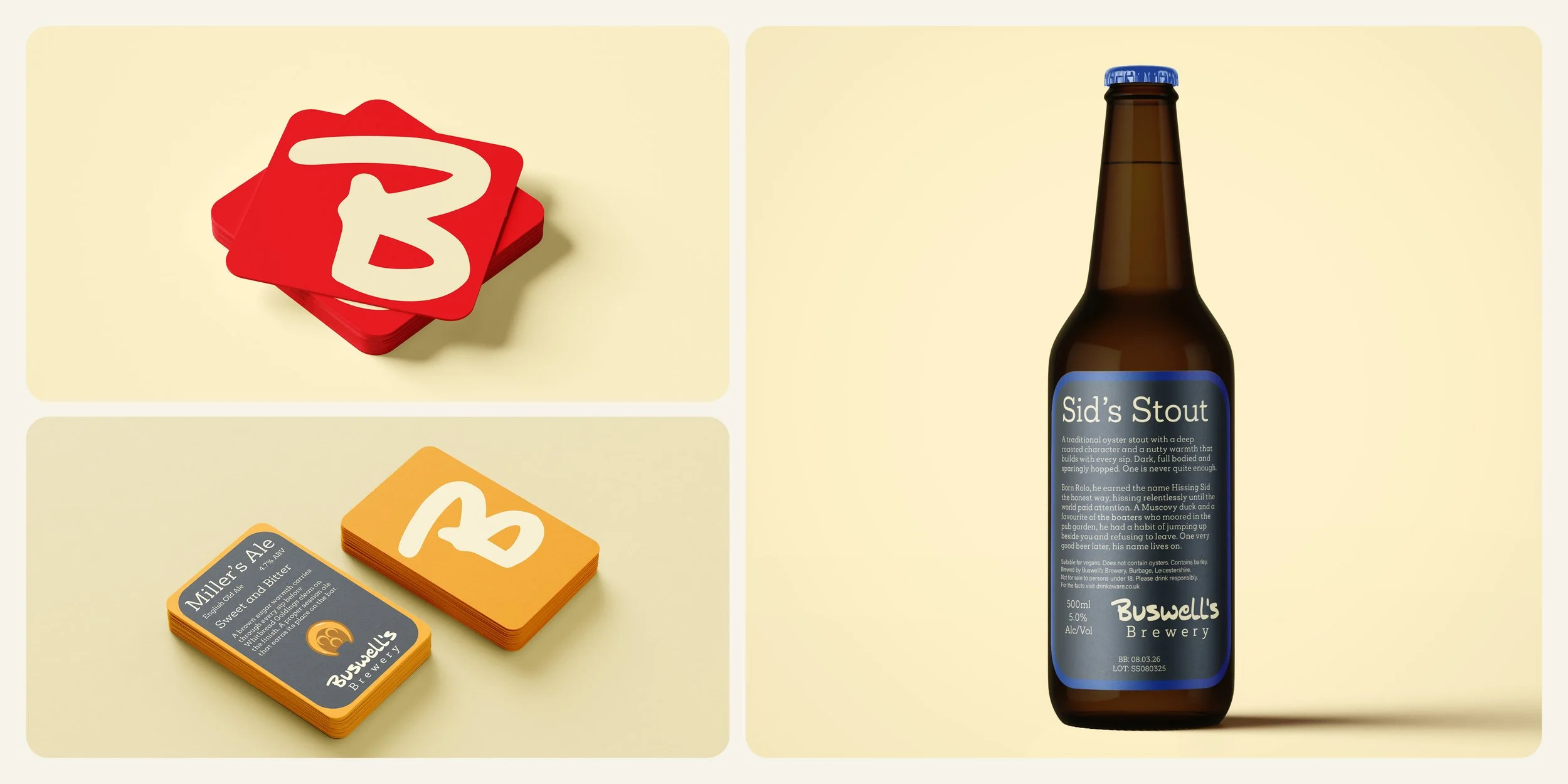
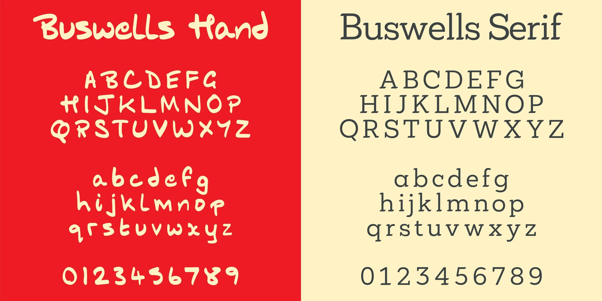
Buswell's Brewery is a live client project developed with my father, Gary Buswell, founder of a real ale brewery currently preparing for relaunch. Two bespoke typefaces, Buswells Hand and Buswells Serif, a palette of named brand colours, a full logo suite, and a range of packaging and print touchpoints were created as part of a complete brand identity built from the ground up.

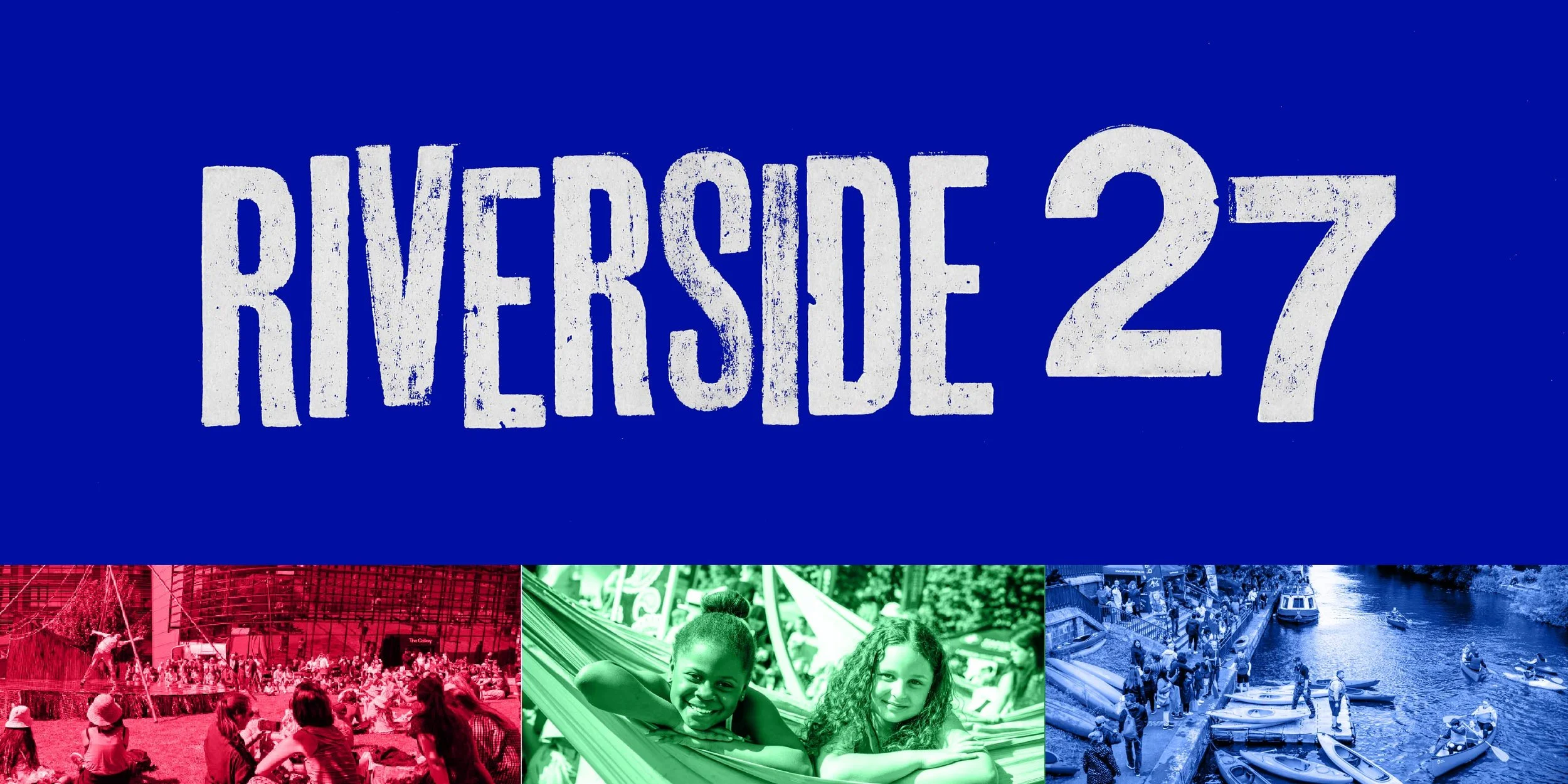
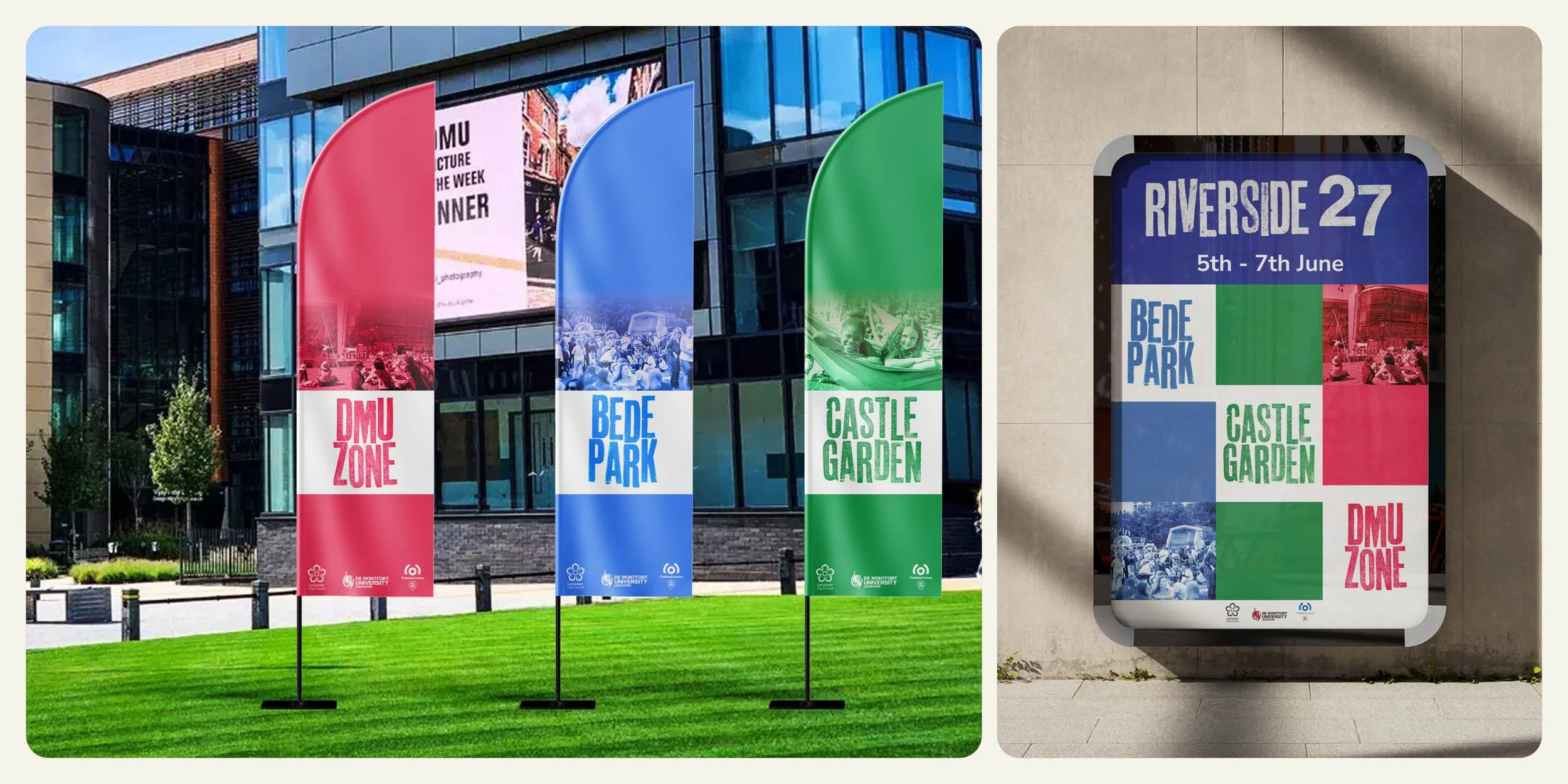
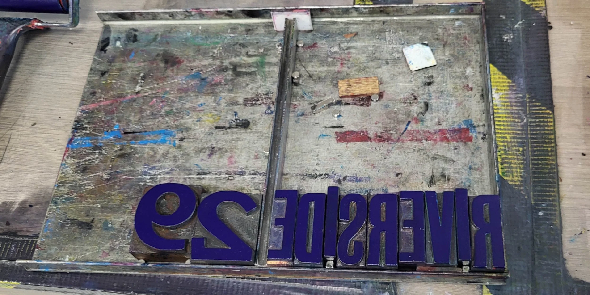
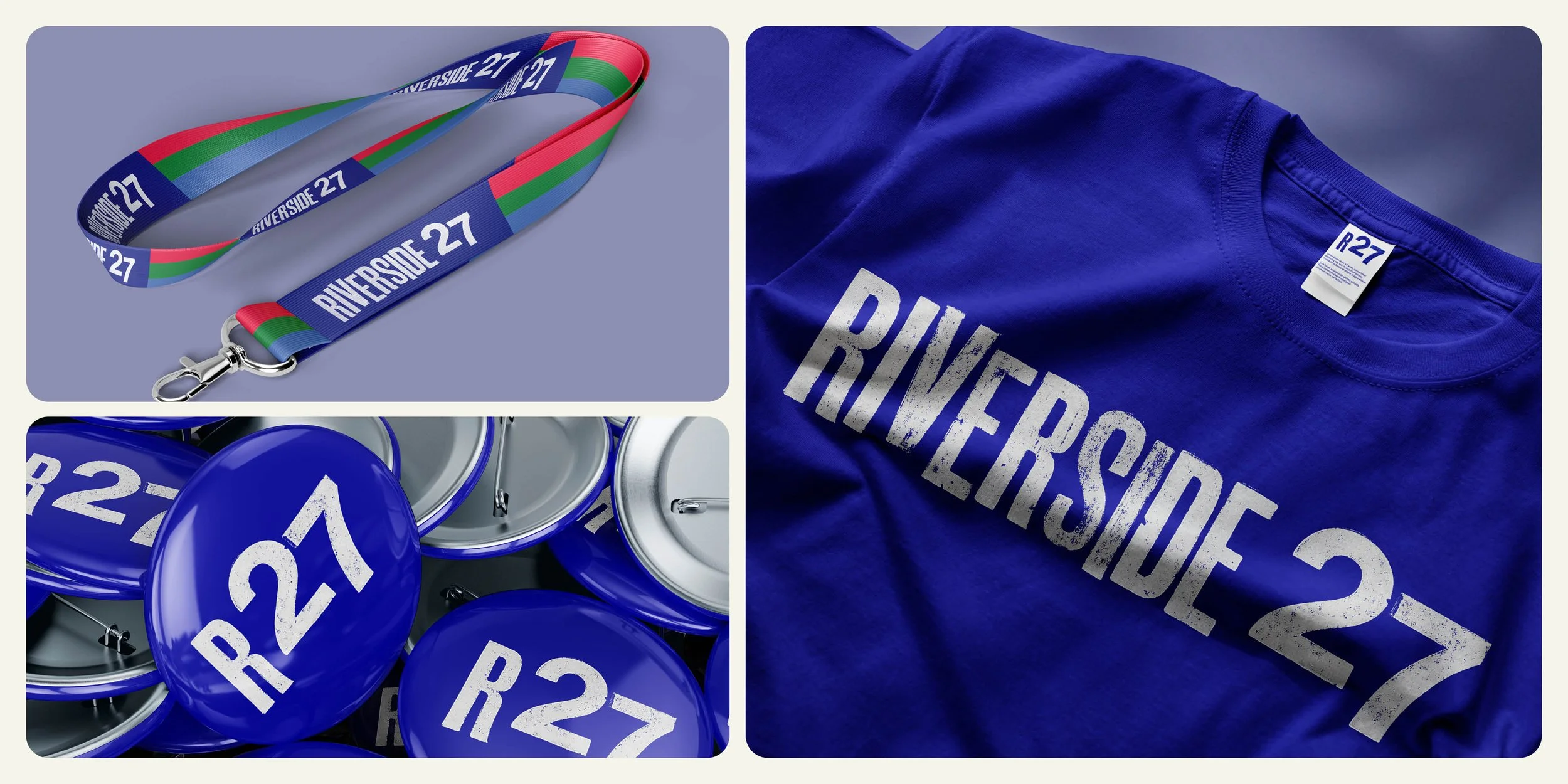
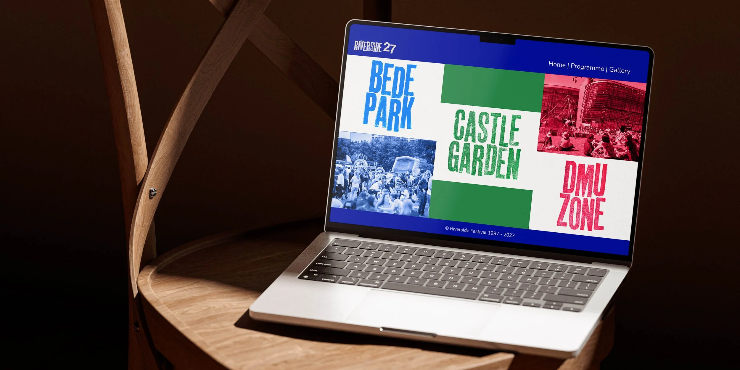
Riverside
Riverside is a branding project for the Leicester Riverside Festival, developed in collaboration with Leicester City Council. The identity uses hand-made letterpress printing for the main logo and a suite of area identities, with colours pulled directly from the ink mixing process. Ink was transferred to paper by hand using a baren, giving the system a warmth and texture that could not be replicated digitally. The aim was an identity that feels people first, rooted in craft and community rather than corporate polish.